Curating Culture in Your Pocket
CONCEPT
ARTS & CULTURE
DISCOVERY APP
WHITE LABEL
Museums’ digital collections are built like catalogues, not products: strong first session, steep week-two drop-off.
ArtQuest treats a museum’s collection like a media library, so saving and returning is the point. One architecture a museum can license, or an app can sell.
Role
Lead Product Designer (solo)
Team
Solo, conceptual project
Tools
Figma, Figma Make, Miro, Claude, Mobbin
Timeline
8 weeks
THE OPPORTUNITY
Three buyers, one problem and one architecture that serves all three.
Museums need engagement and conversion numbers to justify digitization budgets, not page views
EdTech platforms need art content that’s structured and licensable
Consumer apps need “quiet, restorative” categories as screen-time fatigue grows
Vision & Goals
Immersive, remote access to museum collections
Art history delivered in small, digestible formats
Personalization through saves, tours, and curation
A content model supporting three revenue paths without a re-platform
THE GAP
No museum app treats returning as a designed behavior. That’s the opening.
Even engaged users hit the same walls:

Dense, text-heavy content
Walls of text arrive before any value does, so sessions end early.

Fragmented flows
Learning, saving and touring live in separate places with no loop between them.

No continuity between visits
Nothing carries over, so there is no personalisation and no reason to return.
PRIMARY RESEARCH
Ten interviews surfaced the same three patterns.
10 remote interviews (30-45 min), ranging from art enthusiasts to casual museum-goers.
“I love discovering new artists, but I get overwhelmed by too much text. I wish apps would give me stories in small, digestible bits.”
— Carla, after using Google Arts & Culture
AFFINITY MAP — 10 INTERVIEWS, ANONYMISED
Dense, overwhelming text
9/10
“I stop using apps when I feel lost in them.”
Fragmented flows
8/10
“I want to create my own art library.”
No personalisation
10/10
“I want recommendations that feel tailored to my style.”
COMPETITIVE ANALYSIS
The win isn’t more content, better organized. It’s a curation layer on collections institutions already have.
Audited Google Arts & Culture, Smartify and Bloomberg Connects against 12 adjacent discovery apps (Pinterest, Letterboxd, Are.na) via Mobbin, flow by flow.
Strengths
Weaknesses
Key Focus
Google Arts & Culture
Vast archive, high-res images, 360° tours
Overwhelming UX, not personalized
Exploration & Education
Smartify
Audio guides, artwork scanning, clean UI
Limited curation, some features locked
On-site & remote guide
DailyArt
Daily curated artwork stories
Limited discovery, not tour-oriented
Art Education (daily content)
Bloomberg Connects
Multimedia guides from real museums
Only works with partner museums
Museum Virtual Experiences
Also reviewed: GuidiGO, Magnus, Art Authority and Cuseum.
DESIGN CRITERIA
Every research insight became a design criterion.

Accessibility is not optional
Virtual exhibits, adjustable text and assistive tech support, so no one is left out.

Interaction builds immersion
Tapping an artwork for a story, or walking a virtual space, builds emotional context.

Personalization drives retention
Saving, categorising and revisiting art is what makes the experience worth returning to.

Storytelling deepens understanding
Wrapping learning in short narratives turns passive browsing into active learning.
PERSONAS
Mia is the primary: curious, wants curation over metadata, most likely to convert.
Three audiences mapped against one content model.
Mia (primary)
Discover art in idle moments
Consumer subscription
Student
Structured, bite-sized learning
EdTech licensing
Museum (B2B)
Extend reach, prove engagement
White-label / API
USER FLOW
One path from opening the app to saving an artwork.
INFORMATION ARCHITECTURE
Five pillars, mirroring a media app’s mental model, not a museum website.
Started with rapid Crazy 8s layout exploration across two critique sessions, then settled on five pillars, one per tab, mirroring a media app’s mental model library: browse, artist page, playlist, since users benchmark against Spotify, not museum websites.
Home: discovery and search
Tour: virtual and in-person museum tours
Scan: identify an artwork in the room
Favourites: saved and curated content
Profile: preferences, saved arts and settings
KEY ITERATION
Save had to sit above the fold.
Low-fi flows locked the content hierarchy first, specifically whether Save could sit above the fold. Testing later confirmed that as the most consequential placement decision in the app.
THE AI LAYER
AI that answers “why this matters”, grounded in verified museum metadata.
Conversational Art Guide: RAG over verified museum metadata, not open generation. Answers “why this matters” without dense wall text
Adaptive micro-tours: reassemble in real time by time available and prior saves
“Because you saved…”: lightweight rec loop tied directly to the return-rate goal
Feature
Complexity
Dependency
Conversational Art Guide
Medium - RAG pipeline
Clean metadata licensing
Adaptive micro-tours
Medium - rules engine
Tour/location tagging at ingestion
Recommendations
Low - collaborative filtering
None; works from day-one data
VISUAL SYSTEM
A white-label product has to be re-skinnable without a rebuild.
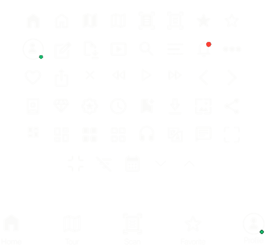
Colour, type (SF Pro Display), a 4px spacing scale, components and iconography all run off tokens, so each institution is a re-skin.
COLOUR
Main Black
#0C0A09 · Splash, full-bleed
Main Grey - BG
#252525 · App surface
Text - Heading
#FAFAF9 · Headings, icons
Text - Pills
#344054 · Pill labels
Button - Default
#242424 · Primary action
Button - Secondary
#ADADAD · Secondary, inputs
Pills - Default
#F2F4F7 · Idle filter
Pills - Selected
#57534E · Active filter
Notification - Red
#FF3B30 · Alerts, unread
Notification - Green
#12B76A · Presence, success
Highlight - Blue
#4783C5 · Links, selection
Highlight - Purple
#7075C9 · Secondary accent
LAYOUT & SPACING
Spacing scale (4px base)
4
8
12
16
24
32
40
48
64
COMPONENTS & ICONOGRAPHY
Button
Button
Type
Option 1
Option 2
Option 3
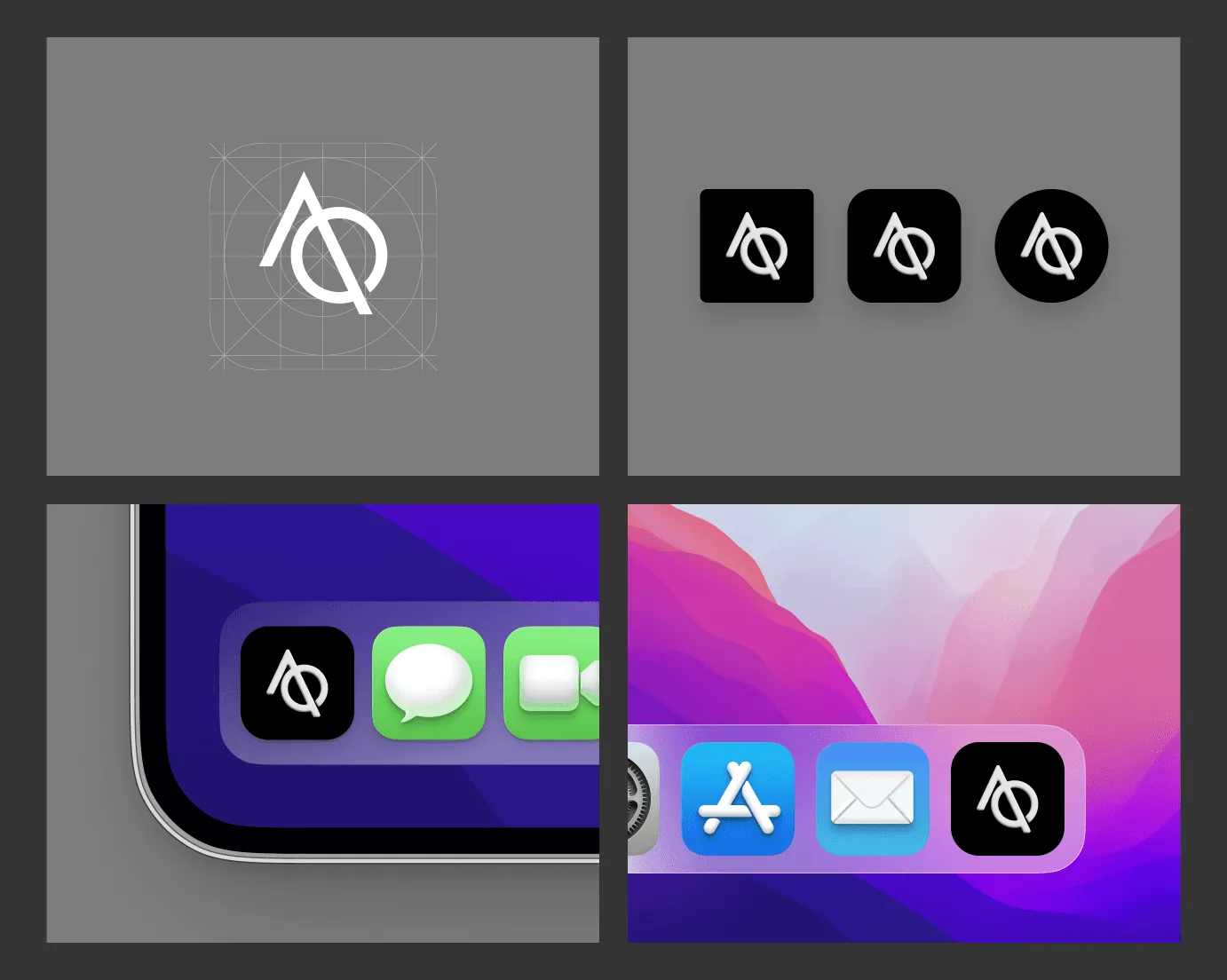
APP ICON
USABILITY TESTING
Four of five finished the task unaided. SUS 82/100.
5 participants, moderated, think-aloud, post-task SUS.
Metric
Result
Task success
4/5 unaided, 1 recovered after one prompt
Time to first save
74s median (target: <90s)
SUS
82/100
Top friction
“Save” below the fold fixed via sticky action bar

4 of 5
Completed the task unaided; the fifth recovered after a single prompt.

74s
Median time to first save, against a 90-second target.

82/100
System Usability Scale score across five moderated sessions.

Top friction
“Save” sat below the fold, fixed with a sticky action bar.
What changed after testing
HIGH FIDELITY SCREENS
Final screens, built from the tested flows.
The flows these screens carry
Explore → Filter → Save → Read about artist
Home → Virtual tour → Enter museum → Tap artwork → Learn & save
Search → Results → Artwork, with optional fields removed
PROJECTED IMPACT
Modelled against category benchmarks, directional, not claimed.

~3 - 4 min → 74s
Time-to-first-value, against the baseline in comparable discovery apps.

22 - 28%
Projected 7-day return rate versus an 8-12% category baseline.

3 revenue paths
One content model serves all three, with no re-platform.
Year-one revenue model
An estimate, not a result. The anchors below are public; the deal counts and licence price are my assumptions.
Consumer membership
50,000 installs × 2.1% conversion = 1,050 subs × $29.99, less 15% store fee
$26,800
Museum white-label
6 licences × $6,000
$36,000
EdTech licensing
4 licences × $6,000
$24,000
$87,000 in year one: about 30% consumer, 70% institutional, off one content model.
Anchors: $29.99/yr is DailyArt Premium’s App Store price; 2.1% is RevenueCat’s median day-35 freemium conversion across 115,000 apps; 35,144 active US museums (IMLS). Assumptions: 50,000 organic installs, 15% App Store commission, a $6,000 licence priced against the cost of a bespoke museum build, and ten institutional deals in year one.
Weakest assumption, stated plainly: Bloomberg Connects gives museums a comparable app free, funded by philanthropy, and Cuseum doesn’t publish pricing. The licence has to be justified against building in-house, not against a paid competitor.
Sensitivity: at the North America conversion median (2.56%), consumer rises to about $32,600; at 25,000 installs, it falls to about $13,400. Institutional deals carry year one; consumer compounds only if the 22 - 28% seven-day return rate holds.
TAKEAWAYS
Users don’t want more features. They want context in small chunks, and a reason to come back.
What testing taught me

Personalization drove returns
Save + Recommend loops lifted revisit intent and session depth in testing.

Tours are a gateway
360° tours boosted engagement, but the conversion moment landed on Artwork Detail.

Accessibility helped everyone
WCAG-forward type, contrast and tap targets improved usability across the board.

Fewer steps, less drop-off
Removing optional fields and compressing Search → Results → Artwork reduced abandonment.

Structure beat visuals
One architecture, three buyers, built in from week one rather than bolted on later.
Next Steps
Queued next, each with the target it has to clear:

Deeper personalization
“Because you saved…” digests, +15% 30-day retention.

AI Curator (beta)
Q&A + tour builder, ≥70% helpful rating, +20% tour completion.

Accessibility pass
WCAG 2.1 AA, LCP <2.5s, zero critical a11y issues before any pilot conversation.
UP NEXT