Talisa — Insurance, Credit & FX

Cutting Talisa’s Agent Dependency

Cutting Talisa’s Agent Dependency

SHIPPED

FINANCIAL SERVICES

SELF-SERVE QUOTES

RESPONSIVE WEB
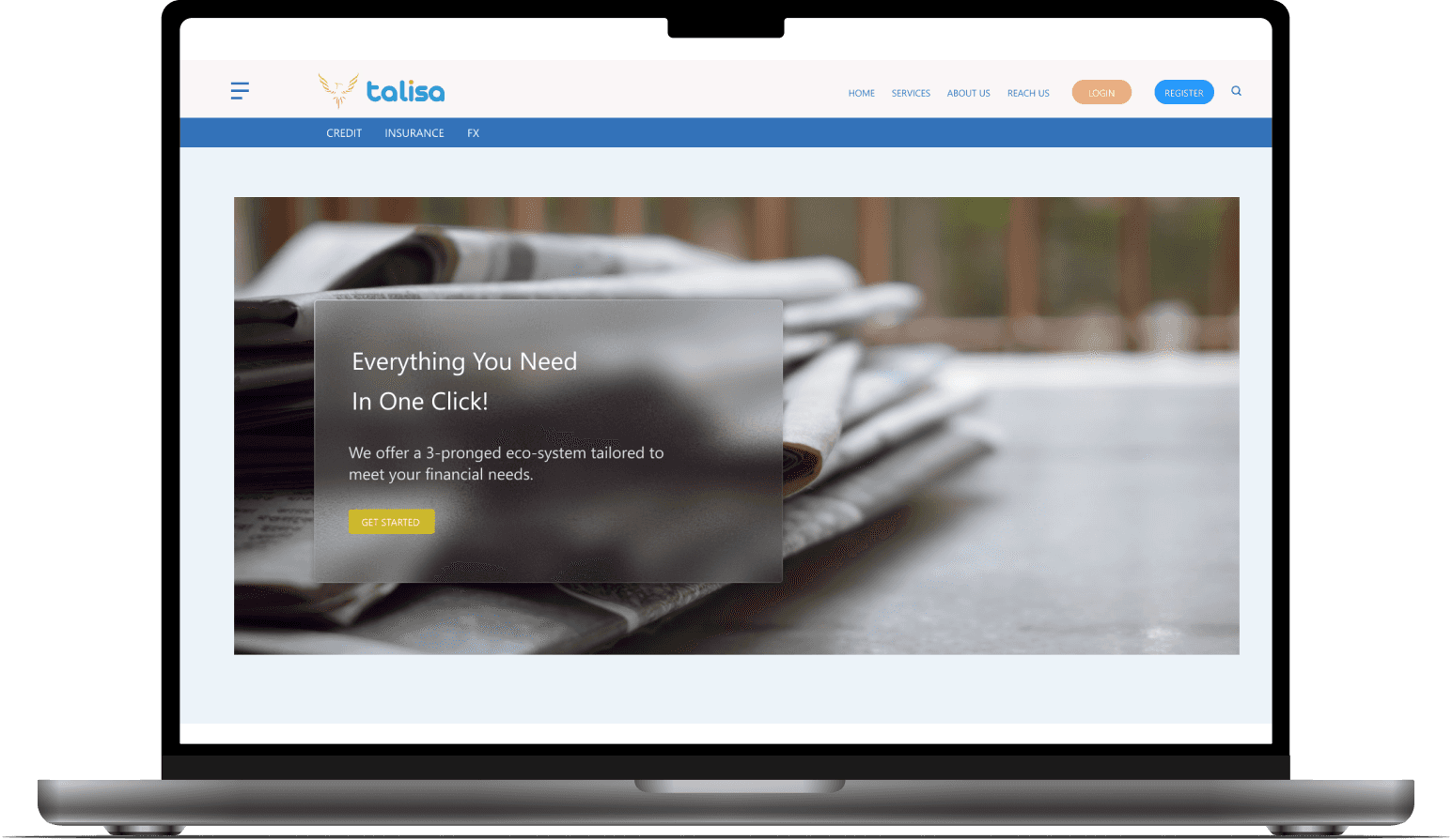
Redesigning a financial services site around self-serve Insurance, Credit & FX

TL;DR

Talisa customers couldn’t get a straight answer about insurance, credit, or FX without calling a broker. I led the end-to-end redesign of Talisa’s site around three clear service paths.

Talisa customers couldn’t get a straight answer about insurance, credit, or FX without calling a broker. I led the end-to-end redesign of Talisa’s site around three clear service paths.

Role

Product / UX Designer (end-to-end IC)

Team

1 PM, 1 tech lead, 2 engineers, 1 marketing partner

1 PM, 1 tech lead, 2 engineers, 1 marketing partner

Tools

Figma, Jira

Figma, Jira

Timeline

6 weeks

6 weeks

Key Outcomes

Key Outcomes

Round-two usability testing moved every tracked metric: service identification 62% → 91%, quote completion 68% → 88%, time-to-quote down 38%, and commitment anxiety 47% → 9%, the largest shift of all. Brokers stayed a first-class user throughout, and engineering shipped with a starter design system they could extend without new design cycles.
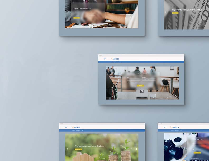
  1. CONTEXT: PROBLEM, AUDIENCE & CONSTRAINTS

  1. CONTEXT: PROBLEM, AUDIENCE & CONSTRAINTS

What is Talisa?
What is Talisa?

Talisa is a direct-to-consumer financial services company that offers insurance brokerage, credit, and foreign exchange (FX) services.

Talisa is a direct-to-consumer financial services company that offers insurance brokerage, credit, and foreign exchange (FX) services.

The business had historically relied on human agents: customers would talk to a broker who explained options and recommended products. The new ambition was to build a modern, digital-first experience that could do more of that early education and guidance online.

The business had historically relied on human agents: customers would talk to a broker who explained options and recommended products. The new ambition was to build a modern, digital-first experience that could do more of that early education and guidance online.

The Problem
The Problem

As Talisa expanded its services, the existing website wasn’t keeping up. It:

  • Didn’t clearly explain what Talisa actually offers

  • Made it hard to explore and compare options

  • Failed to support a clear path to request a quote or talk to someone

This meant potential customers quickly bounced or reverted to calling agents directly.

As Talisa expanded its services, the existing website wasn’t keeping up. It:

  • Didn’t clearly explain what Talisa actually offers

  • Made it hard to explore and compare options

  • Failed to support a clear path to request a quote or talk to someone

This meant potential customers quickly bounced or reverted to calling agents directly.

Unclear offering icon

Unclear offering

The site never plainly explained what Talisa actually offers.

Hard to compare icon

Hard to compare

Exploring and comparing options across services took more effort than it was worth.

No path to act icon

No path to act

No clear route to a quote or a person, so visitors called agents instead.

Users & customers
Users & customers

We focused on two primary user types:

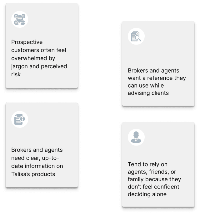
Prospective customers (25 - 50)

  • Want insurance, credit, or FX products

  • Often feel overwhelmed by jargon and perceived risk

  • Tend to rely on agents, friends, or family because they don’t feel confident deciding alone

Brokers & agents

  • Need clear, up-to-date information on Talisa’s products

  • Want a reference they can use while advising clients

  • Need a simple way to capture leads and start applications

We focused on two primary user types:

Prospective customers (25 - 50)

  • Want insurance, credit, or FX products

  • Often feel overwhelmed by jargon and perceived risk

  • Tend to rely on agents, friends, or family because they don’t feel confident deciding alone

Brokers & agents

  • Need clear, up-to-date information on Talisa’s products

  • Want a reference they can use while advising clients

  • Need a simple way to capture leads and start applications

Competitor landscape

Where Talisa sits against five Nigerian financial providers across digital maturity, service coverage and the broker-versus-carrier split.

Company

Digital Maturity

Insurance Brokerage

Credit

FX

Broker vs. Carrier

Direct Axis

High

Limited credit protection

Yes

No

Carrier / Direct lender

Tangerine Africa

High

No (Carrier)

Limited (via savings/loans)

No

Carrier

Hogg Robinson

Low - Medium

Yes

No

No

Broker

Access Bank

Medium - High

Insurance (bancassurance)

Yes

Yes

Carrier (bank)

Coronation Merchant

Medium - High,

Yes (group)

Yes

Yes

Carrier (financial group)

Constraints & context
Six weeks icon

Six weeks

To ship a clearer services experience on existing infrastructure, without changing pricing or fulfilment.

Full breadth icon

Full breadth

Insurance, Credit and FX all had to be supported without confusing users.

Pre-quote only icon

Pre-quote only

Marketing and pre-quote experience. The logged-in portal was explicitly next.

Brand fixed icon

Brand fixed

Early-stage brand guidelines were already in place and could not be reworked.

The bet

Services-first navigation would only work if users already had a rough sense of which category they needed. If that bet were wrong, a journey-based structure “I want to protect my stuff” would have served vaguer intent better, at the cost of the clarity brokers needed. Round-one testing is where it got resolved.

  1. KEY FEATURES

  1. KEY FEATURES

Services-first navigation icon

Services-first navigation

Credit, Insurance and FX sit in the top-level nav rather than under generic menu labels.

Guided hero panels icon

Guided hero panels

Every page opens by naming the user’s goal, how Talisa helps, and one focused CTA.

Step-light quote flows icon

Step-light quote flows

Short quote requests and call-back forms that ask only for essentials, not full applications.

Product and policy cards icon

Product and policy cards

A name, a short description and one next step, so catalogues stay scannable.

FX rates and calculators icon

FX rates and calculators

Rate cards plus calculators, so users can see approximate outcomes before they enquire.

Tap any image to expand.

How might we support the full breadth of services (Insurance, Credit, FX) without confusing users?

THREE DISTINCT JOURNEYS, SHARED PATTERNS

THREE DISTINCT JOURNEYS, SHARED PATTERNS

  1. APPROACH OVERVIEW

  1. APPROACH OVERVIEW

I structured the work into four phases, each with clear outputs to keep the six-week timeline on track.

I structured the work into four phases, each with clear outputs to keep the six-week timeline on track.

Discover & Align icon

Discover & Align

Interviewed customers and brokers; audited credit, FX and insurance flows.

Explore & Define icon

Explore & Define

Set the problem statement, refined user types, mapped the new architecture.

Design & Iterate icon

Design & Iterate

Tested low-fi wireframes, then built high-fi responsive designs for key flows.

Ship & Learn icon

Ship & Learn

Delivered prototypes, specs, a starter design system and next steps.

  1. DEEP DIVE - WHAT ACTUALLY HAPPENED

  1. DEEP DIVE - WHAT ACTUALLY HAPPENED

Tap any board to expand.

Discover & Insights
Discover & Insights
Inputs & activities

Inputs & activities

To ground decisions in real behaviour (not just stakeholder assumptions),

  • Conducted interviews (remote + in-person) with:

    • Prospective customers who had recently purchased or considered financial products

    • Brokers/agents already working with Talisa

  • Observed how users browsed competitor sites and how agents pitched products offline

  • Performed a heuristic review of Talisa’s existing process flow

  • Conducted competitive analysis

  • Reviewed support questions and email threads to spot recurring points of confusion

To ground decisions in real behaviour (not just stakeholder assumptions),

  • Conducted interviews (remote + in-person) with:

    • Prospective customers who had recently purchased or considered financial products

    • Brokers/agents already working with Talisa

  • Observed how users browsed competitor sites and how agents pitched products offline

  • Performed a heuristic review of Talisa’s existing process flow

  • Conducted competitive analysis

  • Reviewed support questions and email threads to spot recurring points of confusion

Telephone interviews icon

Telephone interviews

3+ users across different persona types, ages 25–50.

Face-to-face interviews icon

Face-to-face interviews

4+ users across different persona types, ages 30–45.

Observation study icon

Observation study

3+ users, contextual inquiry in their own environment.

Key Insights - Design Decisions

Key Insights - Design Decisions

Insight

Decision

Customers felt overwhelmed by jargon and risk

Plain-language summaries up front with progressive disclosure, “good for / not good for” sections, and short forms

Users weren’t sure if Talisa was an insurer, a broker, or something else

Services-first homepage with three cards Insurance, Credit, FX and navigation that mirrors the same structure

Brokers wanted a single source of truth for client conversations

Each product page doubles as customer education and broker reference, with clear “talk to us” and “share with a client” CTAs

Both groups said step one wasn’t “buy a policy” but “get a quote or talk to someone”

Quote-request and call-back made the primary action, placed consistently across every page

These insights directly informed the IA, page structure, and interaction patterns.

These insights directly informed the IA, page structure, and interaction patterns.

Strategy & Problem Framing
Problem Statement

Problem Statement

How might we help customers and brokers understand Talisa’s insurance, credit, and FX offerings and confidently start a conversation without needing an agent to explain everything first, so Talisa can scale its digital presence and reduce reliance on purely offline sales?
User Personas

User Personas

Detailed Persona

Detailed Persona

Affinity Map

Affinity Map

A snippet of our affinity map, with information derived from user interviews.

A snippet of our affinity map, with information derived from user interviews.

User Flow

User Flow

The user flow was designed to guide users from discovery to action with minimal friction, using clear service pathways and consistent patterns. Each step helps users understand their options, build confidence, and smoothly transition from digital exploration to human support.
Information Architecture

Information Architecture

The information architecture was designed to make Talisa’s broad financial offering easy to understand and navigate. By structuring the site around clear service categories Insurance, Credit, and FX the IA reduces cognitive load, supports quick orientation, and guides users toward the right service without confusion.
  1. DESIGN EXPLORATIONS & ITERATIONS

  1. DESIGN EXPLORATIONS & ITERATIONS

Tap any board to expand.

Concept Directions
Concept Directions

Three directions for presenting Talisa’s services on the homepage and in navigation:

Three directions for presenting Talisa’s services on the homepage and in navigation:

Product grid icon

Product grid

Rejected. Read as a generic catalog and did nothing to signal Talisa’s category breadth.

Services-first (chosen) icon

Services-first (chosen)

Best resolved the “which category do I need” hesitation while staying legible as a broker reference. Source of the 29-point jump in service identification.

Journey-based icon

Journey-based

Rejected as the primary structure. Its language (“Need a personal loan?”) was folded into hero copy instead, where it helps without costing brokers clarity.

Crazy 8s

Crazy 8s

Low Fidelity Wireframes

Low Fidelity Wireframes

Brand & Design Principles
Usability Testing

Usability Testing

To validate the new services-first information architecture and guided flows, I conducted moderated usability testing with prospective customers and brokers.

To validate the new services-first information architecture and guided flows, I conducted moderated usability testing with prospective customers and brokers.

Key Findings

  • Service categories were clear, but some users hesitated between “Insurance” and specific policy types.

  • Users appreciated the short forms, but wanted reassurance that they weren’t committing to a purchase.

  • Brokers valued structured product summaries but asked for faster access to key details.

  • Some users skimmed past guides and tools unless visually emphasized.

Key Findings

  • Service categories were clear, but some users hesitated between “Insurance” and specific policy types.

  • Users appreciated the short forms, but wanted reassurance that they weren’t committing to a purchase.

  • Brokers valued structured product summaries but asked for faster access to key details.

  • Some users skimmed past guides and tools unless visually emphasized.

Quantified Impact

Quantified Impact

After the moderated sessions and a round of prototype iteration, a second validation round measured improvement across the key tasks. Those results are set out in Outcomes & Impact below.

After the moderated sessions and a round of prototype iteration, a second validation round measured improvement across the key tasks. Those results are set out in Outcomes & Impact below.

Brand attributes
Trustworthy & professional icon

Trustworthy & professional

Reads as a regulated financial institution, not a startup experiment.

Warm & human icon

Warm & human

Lifestyle imagery, soft blues and peaches rather than black-and-green bank cues.

Clear & educational icon

Clear & educational

Typography and layout prioritise legibility and scannability.

Experience principles

Reassure first icon

Reassure first

Hero zones and forms lead on reassurance rather than on features.

One decision at a time icon

One decision at a time

White space, simple cards and short forms.

Same patterns everywhere icon

Same patterns everywhere

Header, hero, CTA and card styles repeat across Credit, Insurance and FX.

High Fidelity Wireframes

High Fidelity Wireframes

LOG IN / SIGN UP

LOG IN / SIGN UP

The high-fidelity wireframes translate the validated information architecture and interaction patterns into a polished, cohesive interface. At this stage the focus shifted from structure to visual hierarchy, clarity and consistency, so Insurance, Credit and FX feel unified under one system while keeping clear, service-specific context.

The high-fidelity wireframes translate the validated information architecture and interaction patterns into a polished, cohesive interface. At this stage the focus shifted from structure to visual hierarchy, clarity and consistency, so Insurance, Credit and FX feel unified under one system while keeping clear, service-specific context.

Tap any screen to expand.

ABOUT TALISA

ABOUT TALISA

CREDIT / FX

CREDIT / FX

INSURANCE

INSURANCE

  1. SHIPPING & COLLABORATION

  1. SHIPPING & COLLABORATION

Cross-functional partnering icon

Cross-functional partnering

Scope and metrics with the PM, feasibility with engineers, tone with marketing.

Launched as a learning release icon

Launched as a learning release

Core flows first, advanced features such as calculators deferred to phase two.

Documented for handoff icon

Documented for handoff

IA, key flows and components in Figma, with a concise implementation guide.

  1. OUTCOMES & IMPACT

  1. OUTCOMES & IMPACT

Round-two testing showed gains on every tracked metric. The standout is purchase anxiety, since anxious users are the ones who revert to calling an agent.

Round-two testing showed gains on every tracked metric. The standout is purchase anxiety, since anxious users are the ones who revert to calling an agent.

Design outcomes icon

Design outcomes

Services-first architecture, guided flows that let people request a quote without an agent, and a visual system matching Talisa’s digital-first positioning.

Expected business impact icon

Business impact

Projected, not measured: more quote requests, higher service-page engagement, fewer basic enquiries reaching agents.

Early feedback icon

Early feedback

Stakeholders felt the value landed; brokers valued one centralised reference during client conversations.

What I can verify is the round-two testing data above, plus a design system and documented IA now supporting the comparison tools, calculators and logged-in dashboard on Talisa’s roadmap.

What I can verify is the round-two testing data above, plus a design system and documented IA now supporting the comparison tools, calculators and logged-in dashboard on Talisa’s roadmap.

Round-two usability testing

Measured across two moderated rounds: the first validated direction, the second measured improvement. One real limitation is that I had no visibility into post-launch conversion analytics after handoff, so these are tested results rather than production figures.

Service identification icon

Service identification

62% → 91%

Share of participants identifying the right service within 10 seconds.

Quote completion icon

Quote completion

68% → 88%

Share of started quote requests carried through to submission.

Average quote time icon

Average quote time

3:40 → 2:15

Minutes to complete a quote request end to end.

Commitment anxiety icon

Commitment anxiety

47% → 9%

Share reporting hesitation before committing to a product.

Broker navigation icon

Broker navigation

70% → 95%

Broker success rate locating product and policy references.

  1. REFLECTION & WHAT’S NEXT

  1. REFLECTION & WHAT’S NEXT

What I’d Improve

  • Add unmoderated testing at scale to further validate quote conversion.

  • Loop engineering into future-state ideation earlier. Some phase-two ideas surfaced too late to scope-check against the timeline.

  • Set up post-launch analytics visibility before handoff, not just pre-launch testing.

Future Opportunities

  • Side-by-side plan comparison tools.

  • Integrated financial calculators (premium, repayment, FX).

  • A unified logged-in dashboard for policy, loan, and FX management.

What I’d Improve

  • Add unmoderated testing at scale to further validate quote conversion.

  • Loop engineering into future-state ideation earlier. Some phase-two ideas surfaced too late to scope-check against the timeline.

  • Set up post-launch analytics visibility before handoff, not just pre-launch testing.

Future Opportunities

  • Side-by-side plan comparison tools.

  • Integrated financial calculators (premium, repayment, FX).

  • A unified logged-in dashboard for policy, loan, and FX management.

Reassurance over autonomy icon

Reassurance over autonomy

Anxiety moved further than any usability metric: feeling supported mattered more than full control.

Designing for brokers helped everyone icon

Designing for brokers helped everyone

Serving the broker case strengthened the experience for everyone, not just a secondary audience.

Structure beats polish icon

Structure beats polish

Clarity and structure built more trust than polish in a category that must feel regulated.