Store2Door — Driver App
Streamlining Driver Onboarding & Task Assignment
Redesigned the driver registration, verification, and task assignment flows for Store2Door’s delivery app — turning a document-heavy compliance process into a guided, self-service flow drivers could complete without calling support.

Context
Project overview
Store2Door connects independent drivers with local delivery jobs. Before accepting a job, drivers must pass license, vehicle, and background-check verification — a compliance-heavy process sitting directly in the activation path.
My role
Lead Product Designer: workflow mapping, wireframes, information architecture, and screen-level decisions across the full driver journey.
Role
Lead Product Designer
Market
Canada · Gig / Last-Mile Delivery
Timeline
3 Months
Tools
Figma
Artifacts shown are wireframes from this engagement. Market data is cited secondary research, not platform analytics, since original research documentation wasn’t retained.
Problem

No pre-qualification
Every applicant hit the full form immediately, with no way to know upfront if they even qualified.

Upload as a black box
Drivers submitted license and registration photos with zero guidance on quality — a leading cause of resubmission and drop-off.

No task clarity before commitment
Drivers assigning themselves to a job had no consistent view of pickup, timing, or recipient before tapping accept.
Opportunity
Driver objectives

Know if I qualify
Before I invest time in the full application.

Get my upload right
First time, without a rejection loop.
See the full job
Every detail before I commit to it.
Business objectives

Protect compliance
Without losing applicants in the process.

Cut manual review
Less load from incomplete submissions.

Scale onboarding
As the driver pool grows.
How might we help a driver qualify, verify, and act with zero wasted steps?
Research
Approach
Original usability data wasn’t retained. The friction points below are grounded in published KYC and gig-onboarding research, cited at the end.
What the industry data shows
68%
Abandon a financial or ID verification application — 38% lacked a required document. (Signicat, 2022)
3×
More likely to quit after a failed document re-upload — the single highest-leverage moment in the flow.

~40%
Typical drop-off for gig driver identity and document verification.
70%
Abandon flows that take longer than three minutes to complete.
Impact on the design
Added a pre-qualification screener ahead of the form
Split the form into a 4-step progression with visible progress
Built upload guidance inline, not after rejection
Gave task assignment a strict, single-screen hierarchy
Design
Readiness screener: qualify before you commit
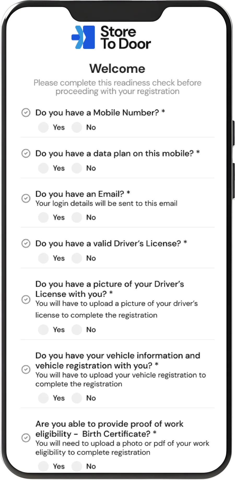
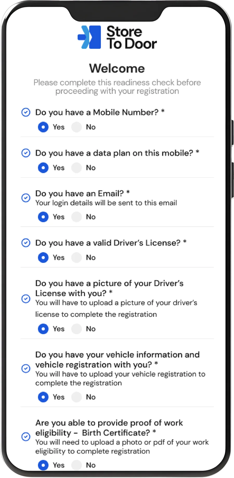
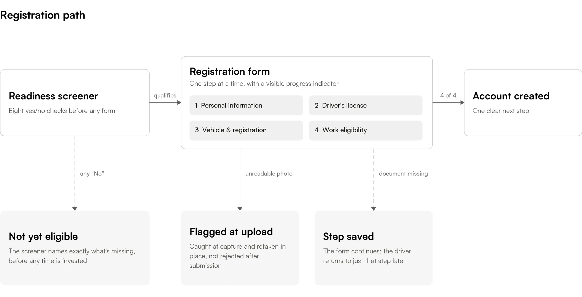
Eight yes/no checks (license, insurance, background check, and so on) gate entry to the form. This turns a mid-form dead end into an upfront, actionable filter.
Personal information: one focused step
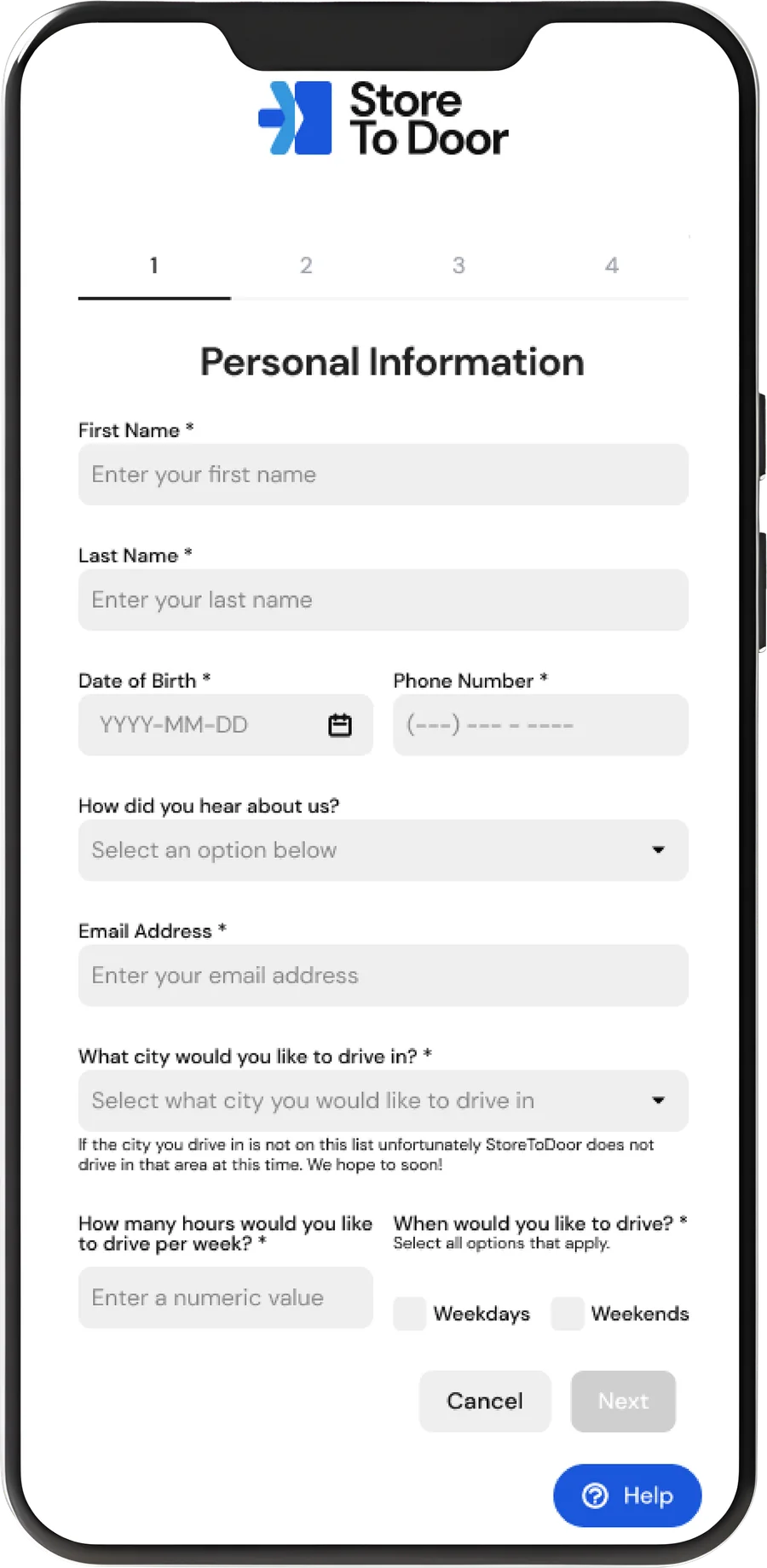
Step 1 of 4 collects only account and matching essentials, with a persistent step indicator. Chunking the form directly counters the 70% long-form abandonment rate.
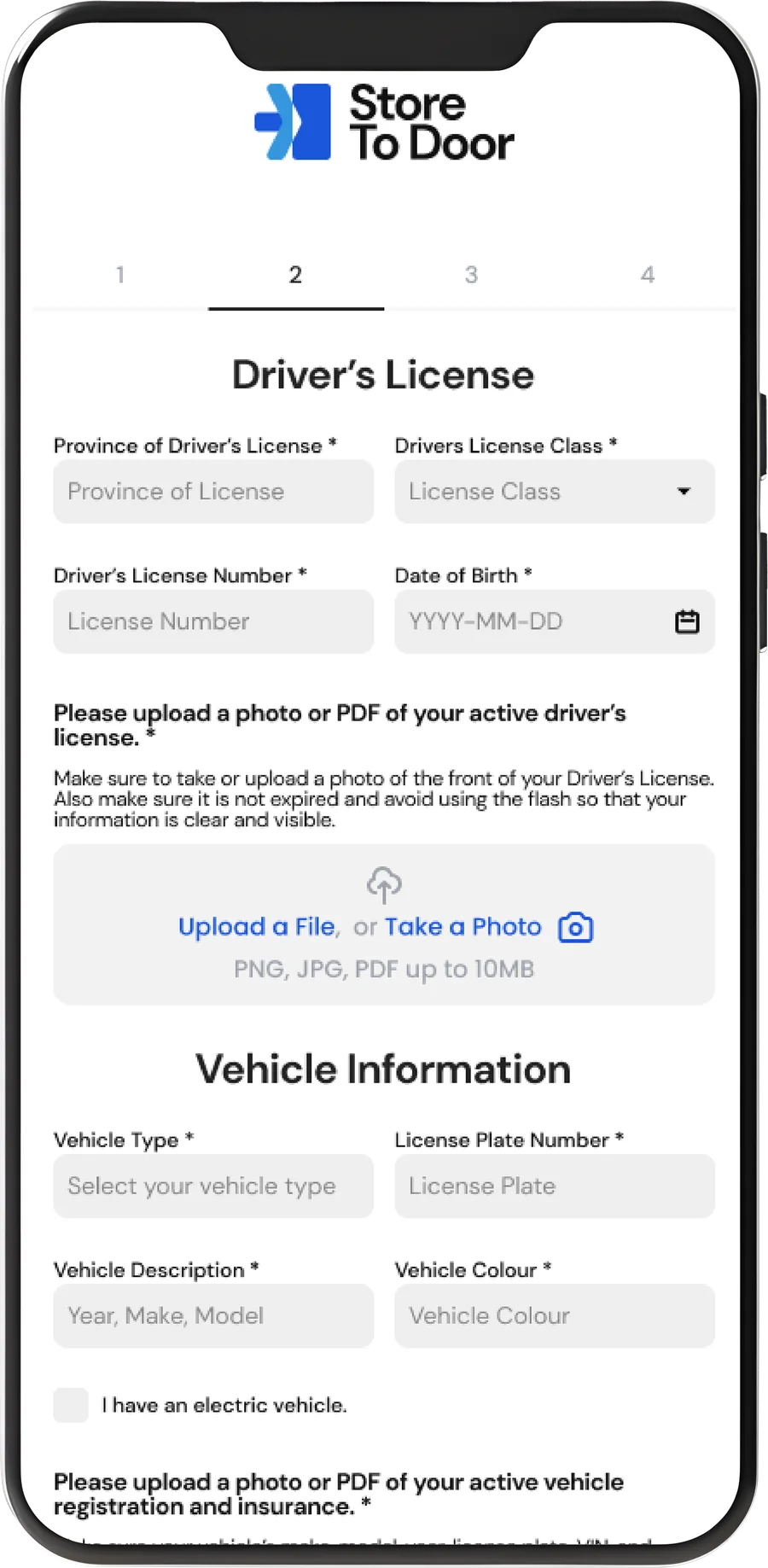
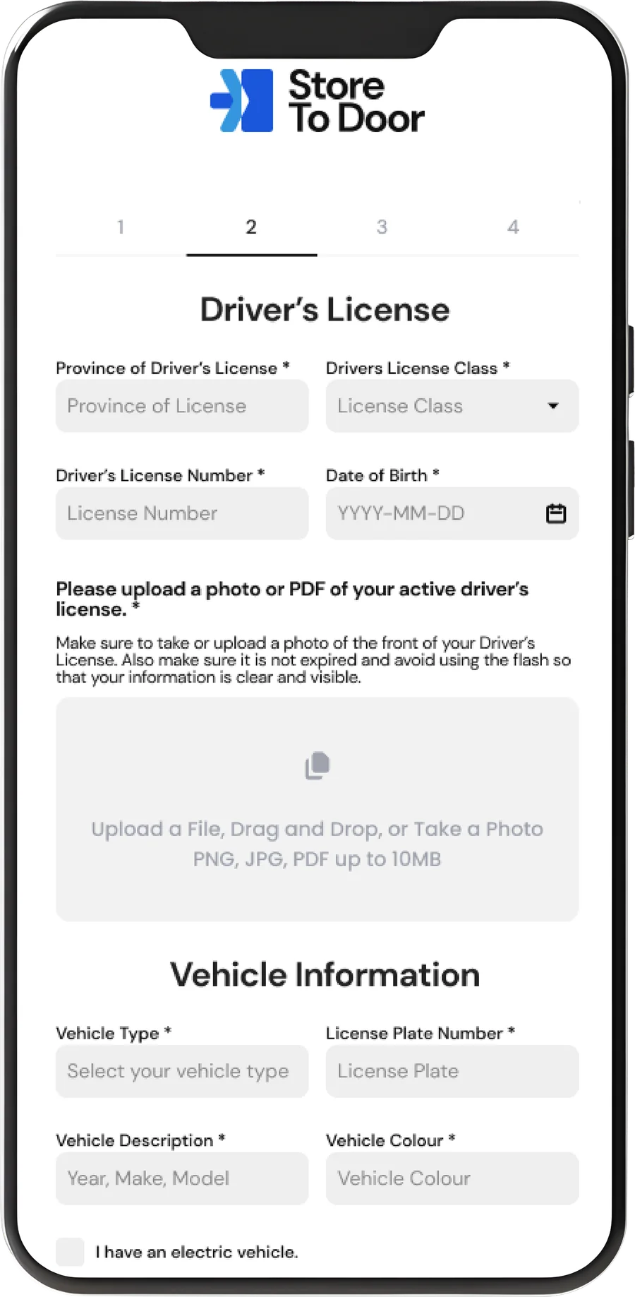
License & vehicle: guidance built into the upload
Structured fields plus upload guidance: no flash, front of license, file limits shown before the photo is taken. This targets the 3× re-upload abandonment risk directly.
Confirmation: one clear next step
A single, unambiguous success state and sign-in path.

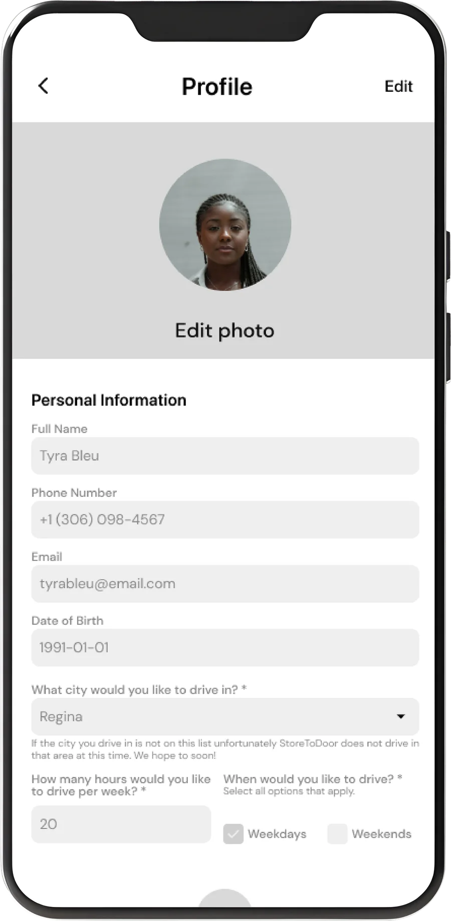
Profile: editable, not re-explained
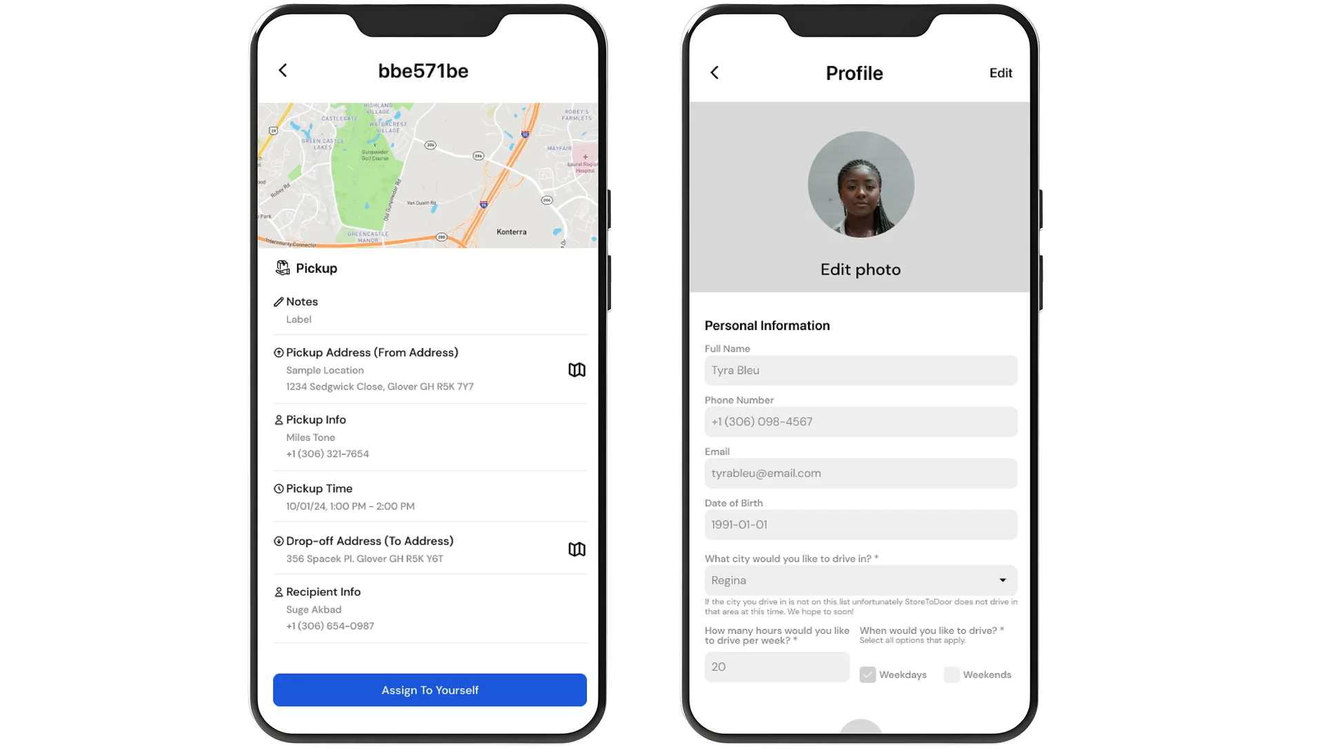
Same field structure as registration, fully editable post-approval, so drivers can self-correct without contacting support.
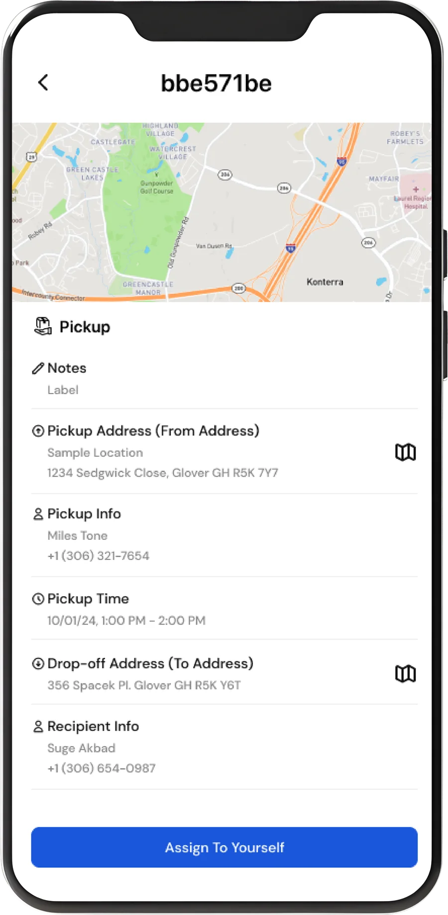
Order assignment: everything before commitment
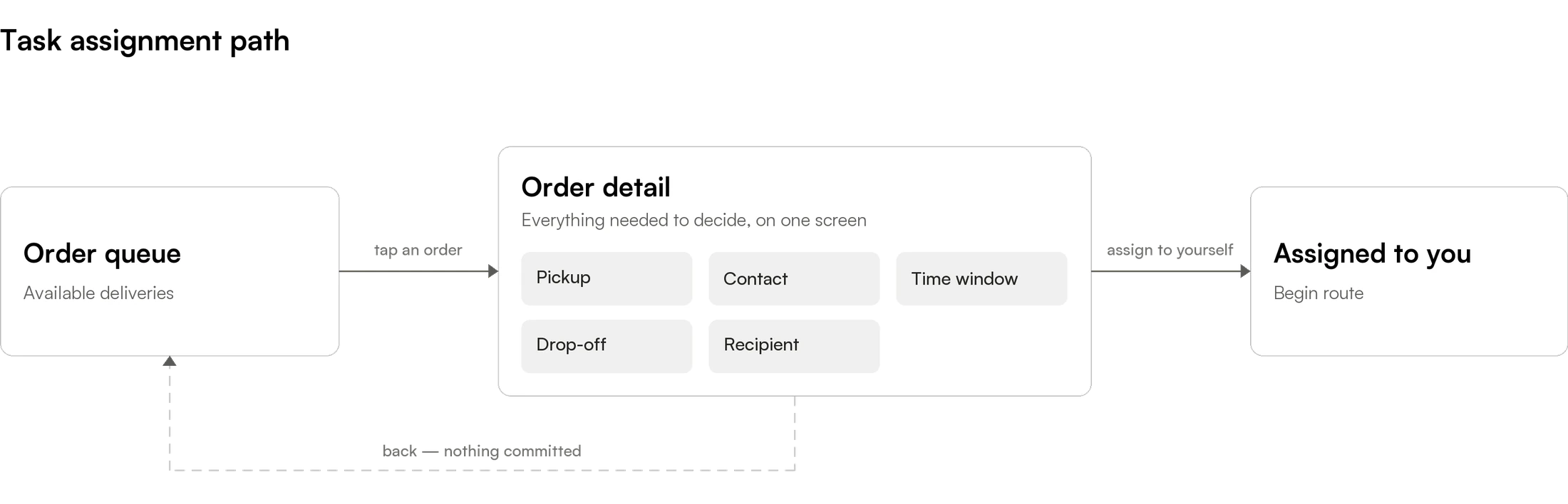
Pickup, contact, time window, drop-off, and recipient in one scannable order, with one CTA. Nothing is discovered mid-route.
User Flow
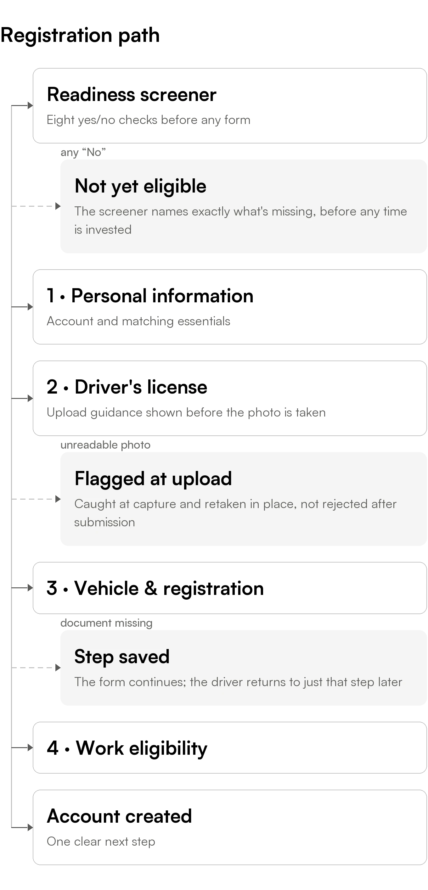
Registration: screener → 4-step form → confirmation
Edge case: missing a document doesn’t block the rest of the form; the driver returns to just that step later.
Edge case: bad uploads are flagged at the point of upload, not after full submission.
Task assignment: queue → single detail screen → commit
Principle: every fact a driver needs to decide lives on the same screen as the action to decide with.

Results
No invented production metrics here; this reflects the wireframe and handoff stage. What the design targets directly:
The screener and 4-step form counter the two largest documented KYC drop-off drivers: missing credentials and long, undifferentiated forms.
Onboarding work from this era at Store2Door is reflected in a program-level outcome: a 10% reduction in time to first successful action and an 8% lift in activation not attributed to any single screen in isolation.
Task assignment consolidates previously fragmented dispatch info into one scannable view.
Lessons Learned

A screener is cheaper than a rejection
Telling someone what they need costs one screen. Telling them after four steps costs trust and support tickets.
Upload guidance is a design problem, not a copy problem
Front-loaded instructions prevented failures that error states could only react to.
Compliance and clarity aren’t in tension
The job was sequencing requirements, not removing them.
Areas for Improvement
Validate the screener
Measure its actual effect on completion rate.
Instrument the upload step
Attempts, rejection reasons, time to success.
Stress-test task detail
Against a dense, fast-moving queue.

Move to primary research
On Store2Door’s own driver base, not secondary sources.