VULTe — Polaris Bank
SHIPPED
FINANCIAL SERVICES
MOBILE BANKING
NATIVE APP
A mobile banking redesign for Polaris Bank, tackling the trust and clarity gaps that keep Nigerian users away from their banking apps.

TL;DR
A mobile banking redesign for Polaris Bank. I led IA, wireframes and screen-level design across onboarding, dashboard, transfers and receipts. Problem framing is grounded in published Nigerian market research, where 71% of users rate in-app support ineffective. Handed off at wireframes; Polaris shipped from there.
CONTEXT
Project overview
VULTe is a mobile banking redesign for Polaris Bank, a Nigerian retail bank. The engagement covered onboarding, the home dashboard, transaction confirmation, and a new lifestyle-services surface. I owned the wireframes, information architecture and screen-level decisions, then handed off at wireframes; Polaris built and shipped from there.
Role
Product Designer
Market
Nigeria Retail Banking
Tools
Figma
Timeline
Wireframe phase, then handoff
PROBLEM
Diagnosing a Trust Deficit
Nigerian banking apps have improved functionally but not experientially. Across the market, three patterns recur:

Cluttered dashboards
Competing visuals and dense navigation increase mental load and slow task completion.

Unclear outcomes
Vague errors and dense interfaces leave users unsure what just happened.

Low trust at the door
Non-users stay away because they don’t understand the app or don’t trust it.
Polaris Bank’s app carried all three: no distinction between new and returning users at signup, no hierarchy on the home screen, and no unambiguous confirmation once a transaction completed.
OPPORTUNITY
Defining What Winning Looks Like
User objectives

Instant clarity
Know immediately whether a transaction succeeded, with no ambiguity.

One-tap access
Reach common banking actions without hunting through a dense layout.

Clear entry path
Understand at signup which path applies to a new account or existing login.
Business objectives

Close the trust gap
Reduce the trust and clarity gaps that push users toward competitor and fintech “super apps.”

Extend engagement
Bundle lifestyle services beyond core banking, matching a broader Nigerian fintech trend.
How might we give users clarity at the moments that matter most: arriving, acting, and confirming?
RESEARCH
Grounding Design in Nigeria’s Banking Reality
What the market research shows

71% find support ineffective
Dashboards across leading Nigerian banking apps are cluttered, with dense navigation.

~30% hit login friction
Transfer flows compound it, buried under too many taps and unclear fees.

Distrust tops the barrier list
Distrust and low awareness outrank cost and access as reasons Nigerians avoid mobile banking.

Network & literacy hinder use
Poor connectivity, low digital literacy and weak support cut short continued use.
Impact on the design
Prioritized an unambiguous transaction-confirmation screen as the single highest-trust-impact moment.
Restructured the dashboard around a favourites-first hierarchy rather than a dense feature grid.
Split onboarding into two clear paths instead of one generic form.
Treated lifestyle services as a differentiation opportunity, not a core-friction fix.
DESIGN
Designing for Clarity at Every Tap
Onboarding: two doors, not one form
New users sign up. Existing users log in. No guessing which applies.
Directly answers the trust/awareness gap identified as the top reason Nigerians avoid mobile banking.
Removes the first-moment friction that pushes hesitant users to abandon before they even start.
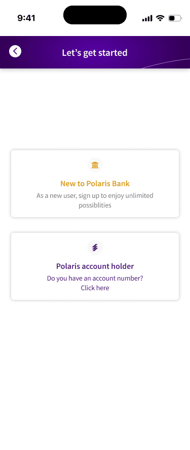
Onboarding: new user vs. existing account holder
Dashboard: hierarchy over density
Balance card first. Favourites second. Everything else in a labeled grid below.
Counters the cluttered, competing visual pattern found across leading Nigerian banking apps.
Users reach their most-used actions (transfer, airtime, bills) in one tap, not a search.

Home dashboard favourites-first hierarchy
Transaction receipt: no ambiguity, ever
Shows the full amount, both accounts and the reference number, with share and download built in.
Closes the trust-friction gap where vague confirmation reads as risk, not relief.
A user never has to wonder “did that actually go through?”

Transaction success itemized, shareable receipt
Lifestyle: banking as a daily habit, not a chore
Flights, hotels, movies, and events are booked from the same app that holds their money.
Positions Polaris against the “emotional assurance” gap flagged as the market’s biggest differentiation opportunity, competing with fintech super apps, not just other banks.

Lifestyle flights, hotels, movies, and events
INFORMATION ARCHITECTURE
Structuring an App Users Can Trust
VULTe organizes around six top-level sections reachable directly from the home dashboard, rather than a deeply nested menu that keeps every core action close at hand.

Site map six top-level sections branching from the app root
Cards and Payments & bills sit as peers, not nested under Home, a flat structure that keeps every core action one tap from the dashboard.
USER FLOWS
Mapping the Paths Users Actually Take
Onboarding: two paths, one destination
The richest flow in the app, and the one with the most trust-building opportunity: a new user completes KYC (BVN/NIN, phone verification, a selfie liveness check) while an existing customer logs in directly, both converging at PIN setup.

Onboarding user flow new user vs. existing customer, converging at PIN setup
Edge case: failed KYC verification (blurry selfie, BVN mismatch) routes back to the same step rather than restarting the whole flow.
Edge case: an unrecognized account number on the existing customer path falls back to the new-user path rather than dead-ending.
Send money: the highest-trust task in the app
Maps directly to the transaction receipt screen covered in the Design section, the moment ambiguity is most costly.

Send money user flow five steps from dashboard to confirmed receipt
Edge case: insufficient balance is caught at the confirm-details step, before PIN entry, not after.
Design principle: every irreversible action is preceded by a confirm step and a PIN-based two-factor intent confirmation, not just security theatre.
RESULTS
Measuring What Actually Moved
Polaris shipped the redesign after handoff, and I had no access to post-launch analytics. Rather than invent numbers, here is the specific, well documented lever each screen was built to move:

Onboarding
Removes the ambiguity non-users cite most often for staying away, a direct lever on activation.

Dashboard
Trades density for hierarchy, targeting the task-completion slowdown found across the market.

Transaction receipt
Closes the trust gap at the riskiest moment, the instant after money moves.

Lifestyle
Repositions Polaris against fintech super apps, going after retention instead of transactions.
LESSONS & NEXT STEPS
Learning to Design for Reassurance

Reassurance is a material
Where trust is the barrier, reassurance is a design material, not a byproduct of polish.

Market data reframes priorities
Market-wide research surfaced friction patterns that changed which screens mattered most.

Small forks, big trust gains
Splitting one ambiguous entry into two clear paths was the single cheapest trust fix in the design.
What I’d do next

Measure the onboarding fork
Compare signup completion before and after launch to see whether two clear paths cut early drop-off.

Track “did it go through?” support
Transfer-status support contacts are the clearest signal of whether the receipt screen is doing its job.

Talk to live users
The work leaned on secondary research. With the app live, primary interviews can test what it assumed.

Explore offline resilience
Network reliability is a documented barrier to sustained use in this market.
UP NEXT